Project
Self-initiated concept
Role
Solo product designer, from research to UI
Timeline
6 months
Deliverables
Kiosk, app, website, packaging, WWF campaign
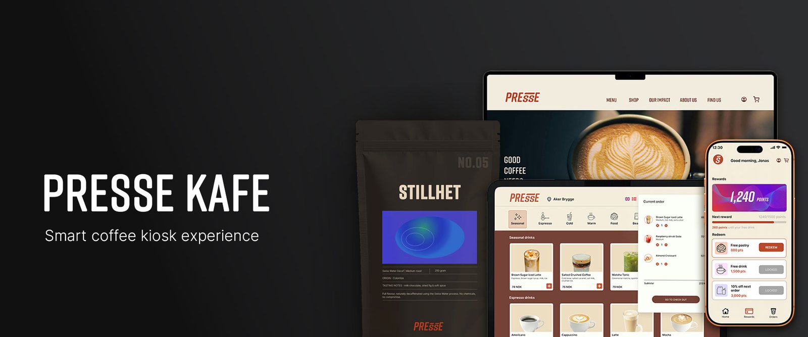
Presse is a fictional Oslo-based specialty coffee concept exploring how morning coffee can feel faster, calmer, and less wasteful.
I designed a connected ecosystem across kiosk, mobile app, website, packaging, and a conceptual WWF Norway mug campaign. The project focused on reducing ordering friction for commuters while making reusable-cup behavior feel more rewarding and easier to repeat.
01. PROBLEM /
Morning coffee asks too much from one queue
Customers browse, customize, ask questions, order, pay, and wait in the same counter flow, while commuters with repeat orders just want to get coffee and go.
For cafés, that same queue can mean slower throughput, more pressure on staff, and potential lost visits during peak hours. Single-use cups add a second friction point: reusable-cup programs exist, but the benefit often feels distant or invisible.
THAT REFRAMED THE CHALLENGE
How might Presse make morning coffee faster and calmer, while making reusable-cup behavior feel rewarding instead of moralizing?
The challenge has two friction points:
1. Queue friction
Morning rush turns the counter into a bottleneck for both commuters and staff.
Opportunity: Move simple, repeatable orders into a self-service flow without disrupting the barista workflow.
2. Reusable-cup friction
Reusable cups are easy to forget when the benefit feels distant or invisible.
Opportunity: Make bring-your-own-mug behaviour feel rewarding through loyalty, impact tracking, and collectible mugs.
02. RESEARCH /
Desk research suggested Norwegians choose value over convenience
As Presse is a fictional case study, I used research to guide the concept rather than draw firm conclusions. I explored Google Trends data from 2020–2025, competitors, and market signals to understand coffee search habits in Norway and interest in sustainability, delivery, and pre-ordering.
The findings pointed to coffee as an everyday habit, with less search interest in sustainability and delivery. This led me to focus on the in-store experience, making coffee quick to pick up, offering good value, and making sustainable choices easy.
WHAT THE RESEARCH SUGGESTED
Coffee interest is high and stable
Coffee appears to be a deeply ingrained daily habit. This made routine, reliability, and repeat use more important than novelty.
Sustainability searches appeared very low
People did not seem to actively search for “sustainable coffee” terms. This suggested that sustainability should be embedded into the experience, not treated as the main marketing message.
Coffee delivery showed little search demand
Search behavior did not point toward strong demand for coffee delivery. This supported a focus on improving the in-store ordering and pickup flow instead.
Users care about brands, deals, and drink types
Search behavior appeared more price-, brand-, and product-driven than eco-driven. This suggested that sustainable behavior needed to be connected to clear value: rewards, savings, progress, and desirable products.
03. OPPORTUNITY /
Competitors improved ordering,
but left the morning-rush moment underdesigned
Competitor research suggested that coffee brands addressed parts of the experience, but rarely the morning rush as a whole. Kaffebrenneriet offers a simple reusable-cup discount, while Starbucks links reusable cups more clearly to rewards. Espresso House communicates sustainability, though its reusable-cup experience in Norway appeared less developed. These approaches encourage reuse, but often leave it as an extra step: customers need to remember their cup, mention it at checkout, and receive a small discount.
For Presse, this suggested an opportunity to integrate cup reuse into the ordering experience. Beyond offering a discount, the concept could make reuse more visible, easier to track, and more rewarding, while also making morning orders smoother.
WHAT COMPETITORS SOLVED — AND MISSED
Simple incentives
Reusable-cup discounts are easy to understand, but they do not create much emotional value.
Separate touchpoints
Ordering, loyalty, sustainability, and retail products often work as separate experiences.
Limited habit-building
The behavior depends on customers remembering the cup, rather than the system making the habit easier to repeat.
Opportunity for Presse: Presse could own the morning-rush routine by connecting speed, loyalty, and reusable-cup behavior into one habit-building ecosystem.
04. USER /
Two commuter needs shaped the experience
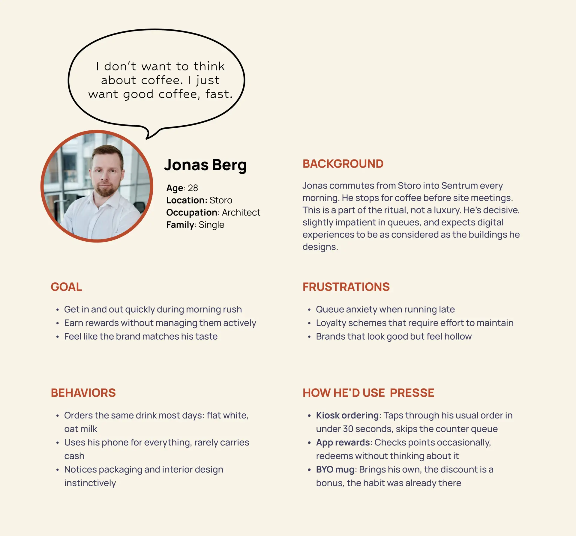
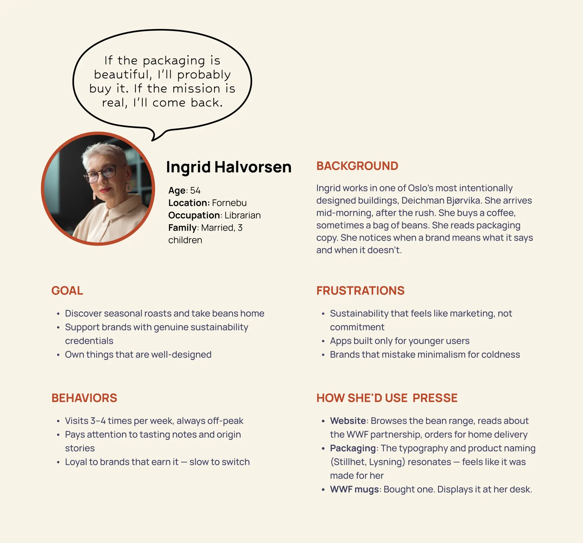
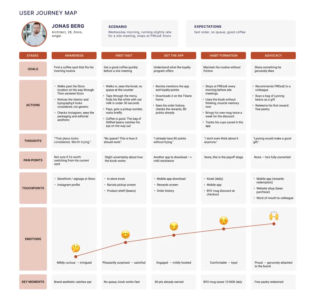
I used proto-personas and a journey map to understand where the morning coffee experience created friction.
Jonas represented the commuter who needed speed before and during the café visit. Ingrid represented the regular customer who needed value, trust, and a reason to repeat reusable-cup behavior over time.
05. STRATEGY /
I chose a connected ecosystem because one app could not support the full journey
The research and proto-personas suggested that the experience needed to extend beyond a single screen. Jonas needed speed before and during his café visit, while Ingrid needed value, trust, and a reason to keep choosing reusable options. An app could support parts of this journey, but the wider experience also depended on what happened in the café and between visits. This led me to design Presse as a connected ecosystem across four touchpoints.
ECOSYSTEM ROLES
Kiosk → reduce counter pressure
Move simple ordering and payment away from the barista queue.
Mobile app → build repeat behavior
Connect loyalty, bring-your-own-mug rewards, and environmental progress.
Website → explain the brand
Communicate the story, roasts, locations, and WWF Norway mug concept.
Packaging → extend the ritual
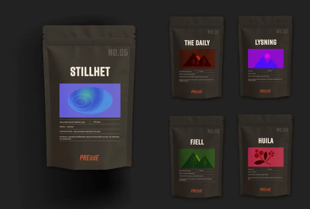
Make each roast feel collectible, giftable, and recognizable beyond the café.
Strategic shift: Presse was not designed as another coffee-ordering app. It was designed as a system where speed, loyalty, sustainability, and brand desire support the same daily routine.
06. BRAND /
A dark editorial identity made PRESSE feel serious, local, and premium
To distinguish Presse from bright, friendly coffee chains, I developed a grounded, editorial identity. The brand feels serious about coffee yet warm enough for everyday use, with a subtle approach to sustainability that avoids familiar green clichés.
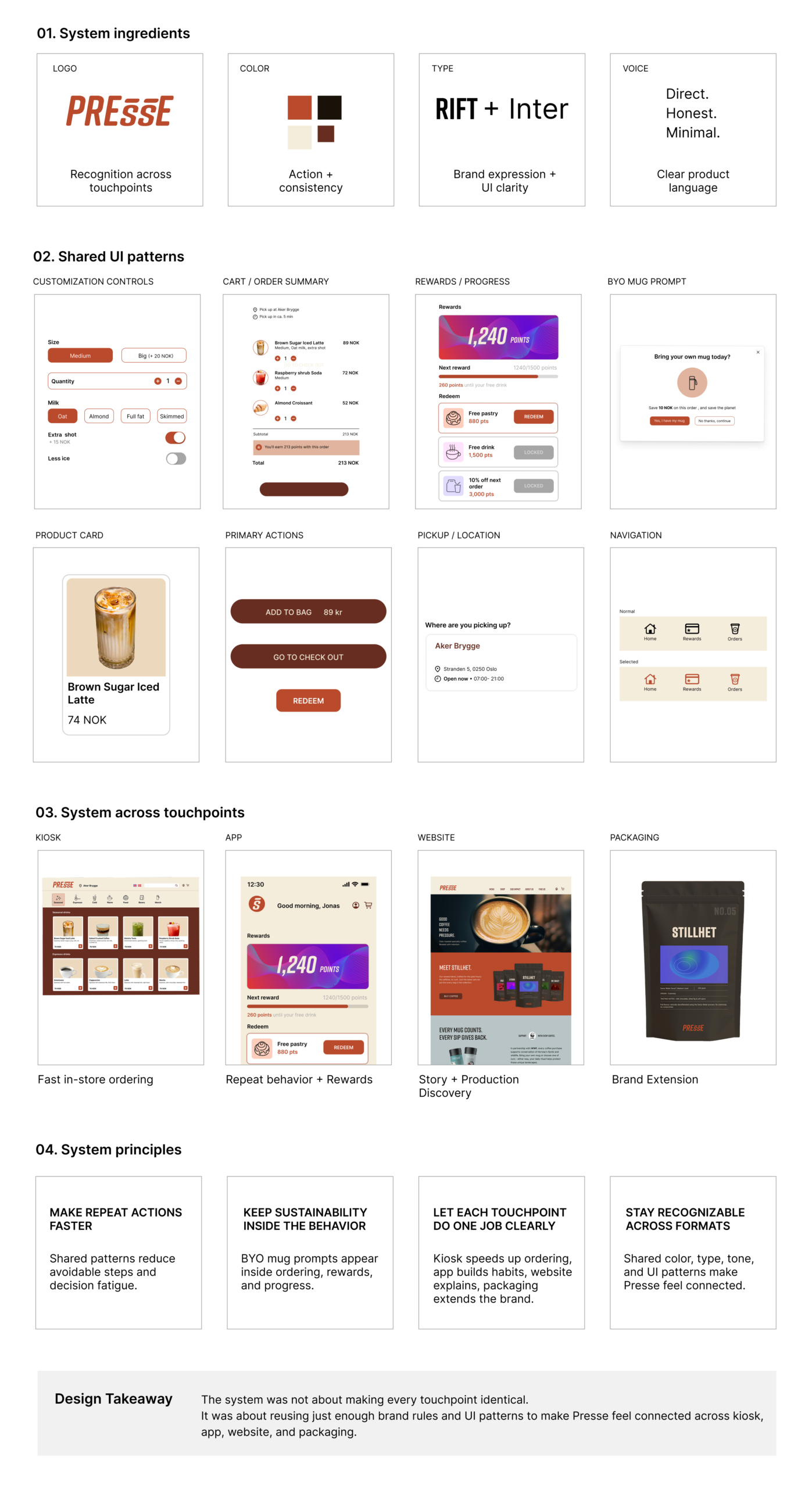
BRAND SYSTEM
The identity uses Rift for a strong display voice, Inter for clarity, and a cream, dark ink, and rust palette across product and brand touchpoints.
The goal was to make Presse feel consistent across kiosk screens, app UI, website, packaging, and the WWF Norway mug concept.
07. DESIGN /
I removed avoidable ordering steps without redesigning the staff workflow
The design focused on making ordering faster for customers while keeping the café’s drink preparation process unchanged. I created an additional path for simple repeat orders that works alongside the counter service.
7.1 Main design decisions
→ Keep staff workflow familiar
The kiosk handles ordering and payment, while drink preparation still follows the existing café workflow.
→ Make repeat orders faster
Common drinks, saved preferences, and clear customization steps reduce decision time for commuters like Jonas.
→ Make reusable cups part of ordering
Bring-your-own-mug behavior appears inside the order flow, not as a separate sustainability message.
→ Use the app after the visit
The app extends the experience through rewards, progress, and environmental impact.
7.2 From journey to flow
I mapped Jonas’s commuter journey to locate the main friction points, then translated them into a simpler kiosk ordering flow.
7.3 Early structure
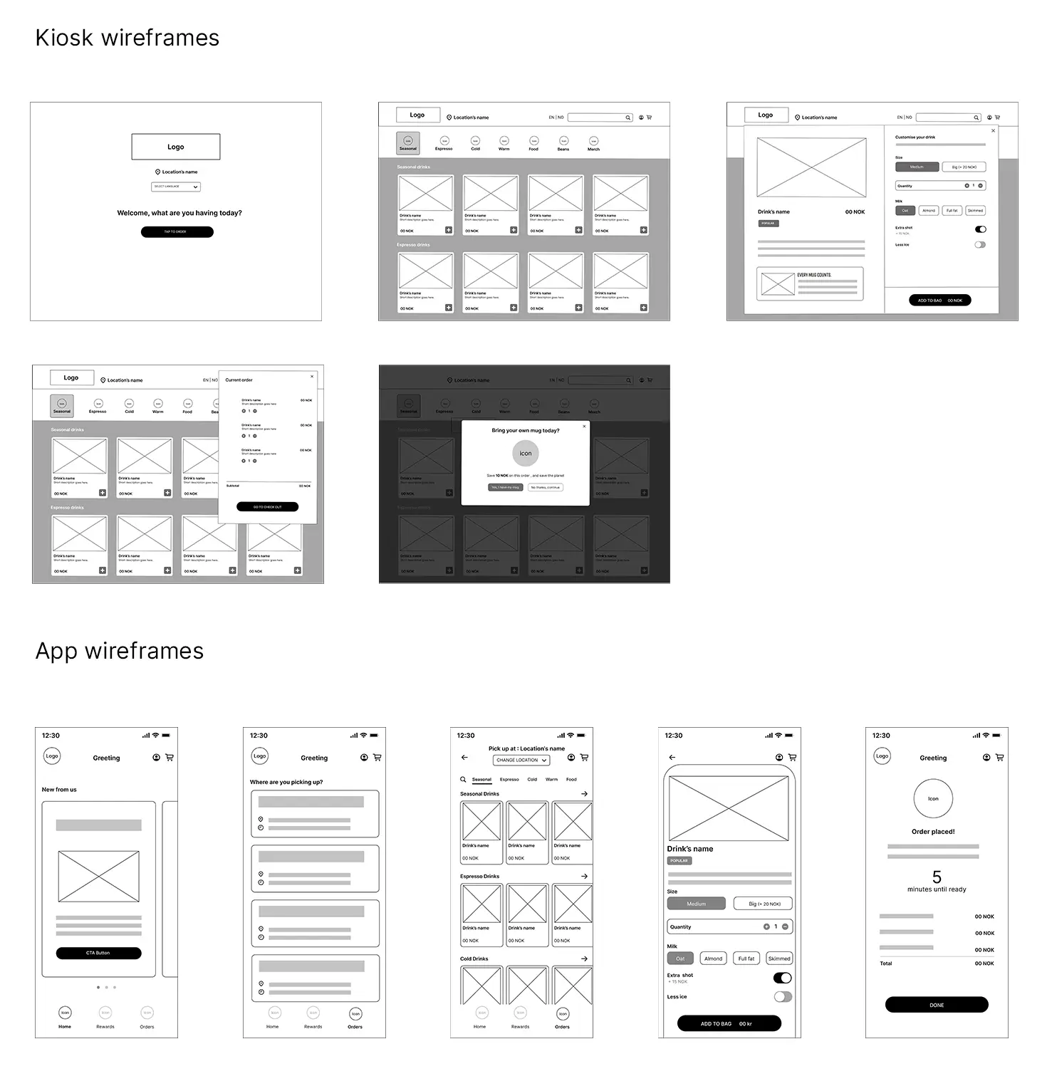
I used low-fidelity wireframes to define the kiosk and app structure before applying the brand system.
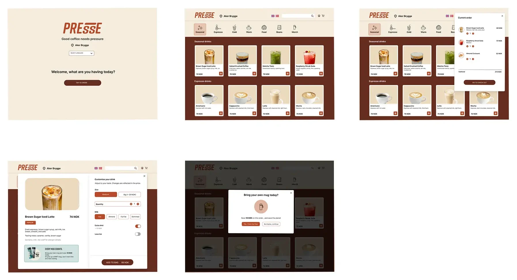
7.4 Final kiosk flow
The kiosk is the core ordering solution, giving simple repeat orders a faster path away from the counter.
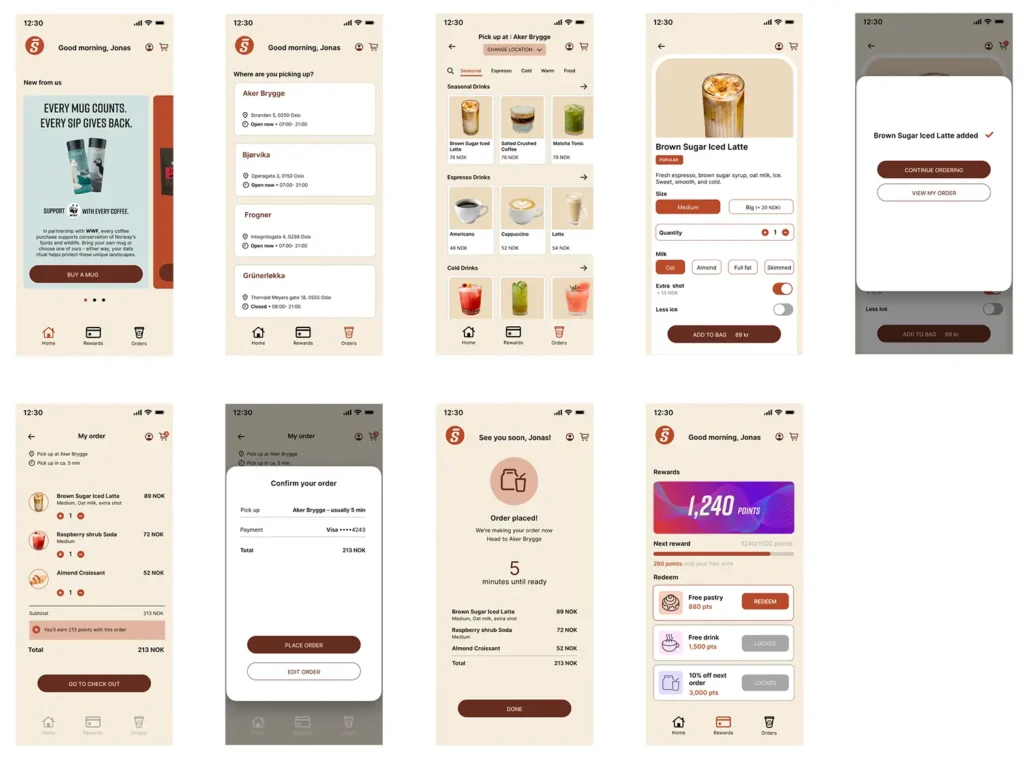
7.5 Final app flow
The app supports repeat behavior through loyalty, reusable-cup progress, and sustainability rewards.
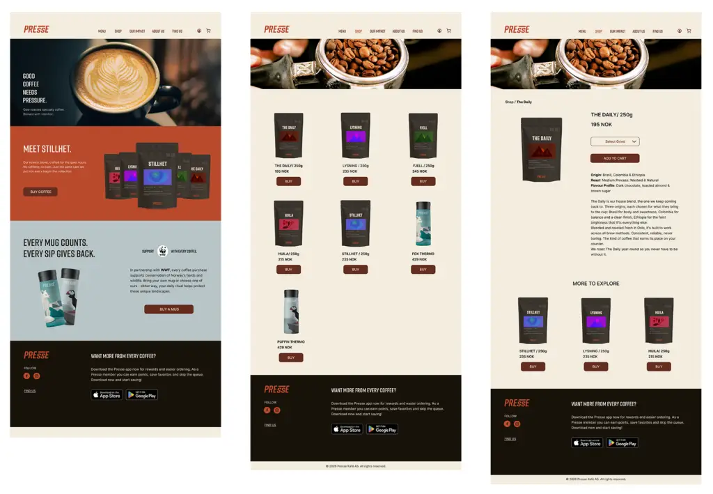
7.6 Final website flow
The website supports brand storytelling, roast discovery, locations, and the WWF Norway mug concept.
7.7 Packaging as brand extension
The packaging extends the brand beyond the café and gives each roast a distinct identity.
7.8 Design takeaway
The final design connects four touchpoints across the morning coffee journey. The kiosk is designed to ease pressure at the counter, while the app encourages return visits and cup reuse through rewards and visible progress. The website introduces the brand and tells the campaign story, and the packaging carries the experience beyond the café.
Together, these touchpoints aim to make ordering faster, create a consistent brand experience, and give customers more reasons to return.
Kiosk
→ Faster ordering
App
→ Repeat behavior
Website
→ Brand storytelling
Packaging
→ Brand extension
08. SYSTEM /
Reusable patterns kept the experience consistent across touchpoints
I defined reusable interface patterns for product browsing, customization, loyalty, pickup, and location information to create a consistent experience across the kiosk, app, and website. These shared patterns connect the touchpoints while allowing each to adapt to its context of use.
09. REFLECTION /
What I learned from designing across an ecosystem
Presse helped me grow from designing individual interfaces to thinking about how a whole customer journey fits together.
The main challenge was connecting kiosk ordering, mobile rewards, website storytelling, packaging, and the WWF Norway mug concept while keeping the experience simple. This taught me to consider both the purpose of each touchpoint and how it supports the next step in the journey.
The project also shaped my approach to sustainability in design. Convenience, visible progress, and everyday value became central to how I encouraged cup reuse. Testing whether these choices make reuse easier and more appealing would be an important next step in developing the concept.
WHAT I WOULD TEST NEXT
Kiosk usability
Test whether commuters can complete a repeat order quickly and confidently during a morning-rush scenario.
Reusable-cup prompt
Test whether the bring-your-own-mug prompt feels helpful and rewarding, rather than interruptive or preachy.
Loyalty motivation
Test whether users understand the connection between rewards, environmental progress, and the WWF Norway mug campaign.