Logos, visual identities, brand guidelines, print and digital materials
A selection of branding projects for organisations in Norway and internationally, spanning academic conferences, community organisations and technology startups. Each project brings a distinct identity to life through print and digital applications.
AVSE Global
I work with AVSE Global (the Association of Vietnamese Scientists and Experts) on visual identities and communication materials for its international conferences. My work spans CIGOS and multiple editions of VSOE, from conference logos and brand guidelines to print and digital applications. The collaboration continues with materials for VSOE 2027.
CIGOS 2021
For CIGOS 2021, a conference on geotechnics, civil engineering and structures, I designed the conference logo and a coordinated set of materials, including web banners, a guidebook, a flyer, participation certificates, invitations and an event backdrop.
VSOE (2018 – present)
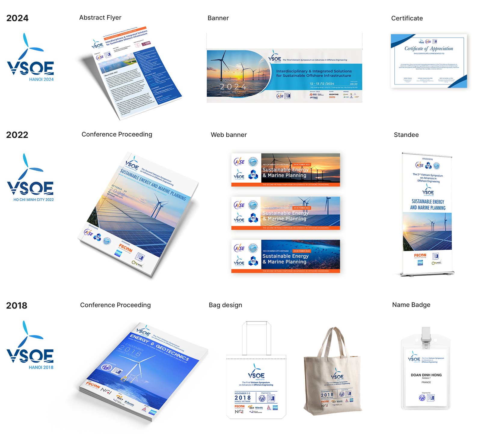
For VSOE (the Vietnam Symposium on Advances in Offshore Engineering), I designed the conference’s visual identity and have adapted it across successive editions. The work includes brand guidelines, conference booklets and proceedings, web and event banners, name badges and souvenirs, evolving the identity while keeping it recognisable from year to year. I’m currently developing materials for VSOE 2027 in Ba Ria, building on the established identity. These will be shared after the conference.
VFOO
VFOO (Den Vietnamesiske Familieforening i Oslo) is the Vietnamese Family Association in Oslo. They needed a logo that felt warm and rooted in Vietnamese identity, while reflecting their focus on family and community.
THE CONCEPT
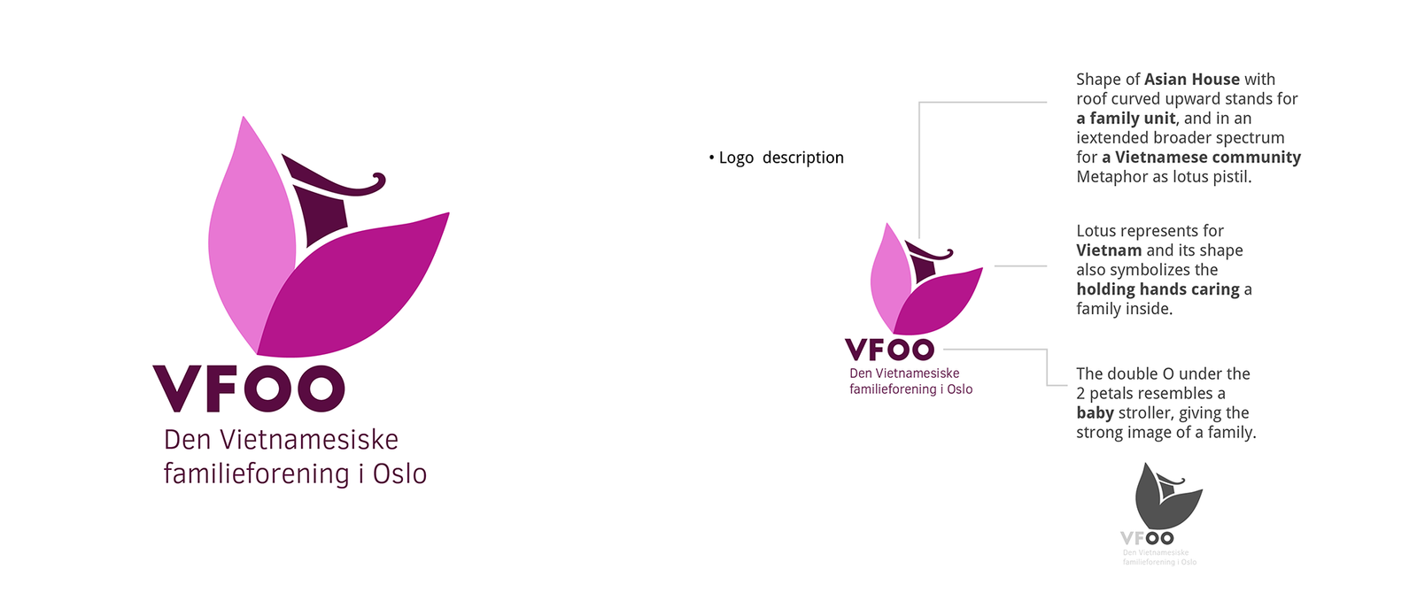
I built the logo around a lotus, connecting Vietnamese identity with the idea of care. Its petals resemble hands cradling a family, while the curved roof evokes a traditional Asian home, suggesting protection and belonging. The two O’s in VFOO form the wheels of a baby stroller, a small detail that connects the name to family life.
B'ZEOS
B’ZEOS is a startup developing seaweed-based alternatives to conventional plastic. In 2020, I designed its logo to reflect the company’s connection to the ocean and its ambition to reduce plastic waste.
THE CONCEPT
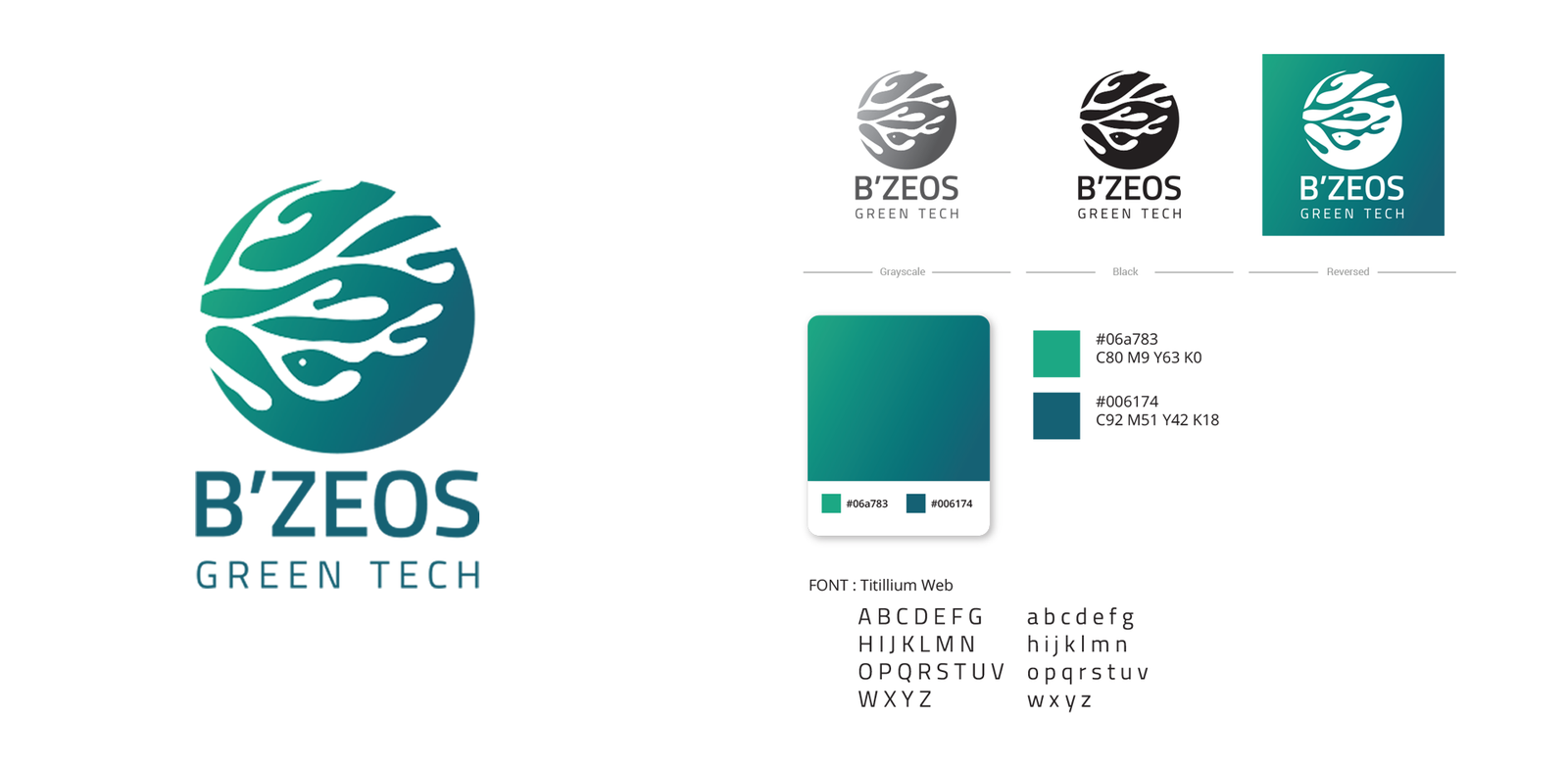
The logo combines a globe, seaweed and a fish, connecting the company’s raw material with the marine environment and its international outlook. Flowing shapes suggest movement and flexibility, while a teal-to-deep-blue palette reinforces the ocean connection. I paired the symbol with Titillium Web to give the identity a clear, contemporary feel.
Bærum International Hub
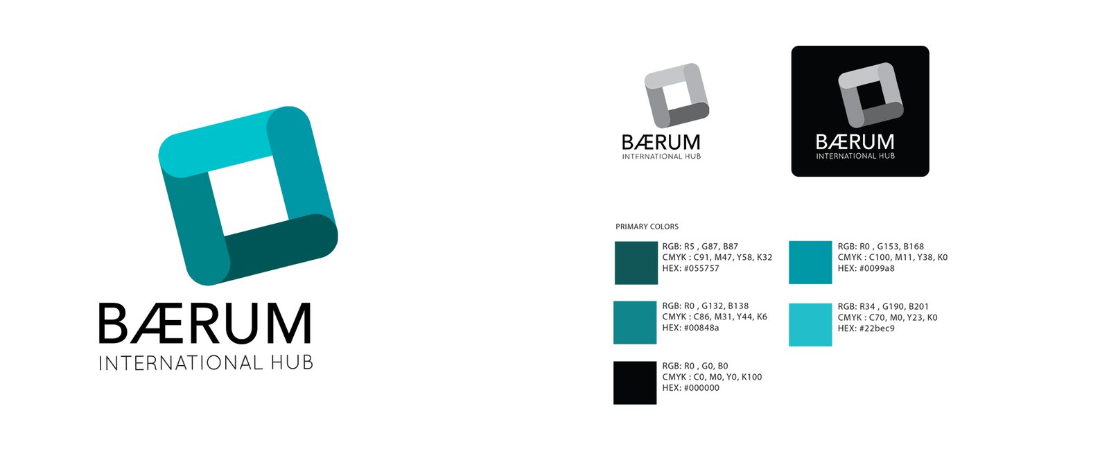
Bærum International Hub is a startup community and coworking space in Høvik, and a sister organisation of Oslo International Hub.
THE CONCEPT
Four connected shapes represent people and businesses coming together, the community at the heart of the hub. A palette of deep and bright teals gives the identity a fresh, welcoming feel.